
top of page
  • Jul 10
  • 4 min read

Smart Theme Switch – Add Light & Dark Mode to Any Framer Site

Smart Theme Switch is a Framer code component that adds a one-tap light and dark mode toggle to your site. It flips every page instantly, remembers each visitor's choice, and works with your existing Framer Color Styles automatically. No custom code, no duplicated styles, no flash of the wrong theme.


What Smart Theme Switch Does

Framer already lets you design light and dark variants of your Color Styles, but by default a visitor only ever sees the version that matches their device. There is no built-in way to give them a switch — and rolling your own means writing code that rewrites stylesheets, tracking state across pages, and hoping nothing breaks on export.

Smart Theme Switch handles all of it. Drop the component onto any page, point it at your brand colors, and it becomes a live control that flips your entire site between light and dark on a single tap. It reads the light and dark styles Framer already generates and re-applies the set the visitor chooses — so every background, text color, border, and surface repaints together, with zero manual wiring.


How It Works

When you use Color Styles in Framer, Framer compiles them into light and dark variants behind the scenes. Smart Theme Switch reads those variants and, when a visitor picks a theme, applies the matching set across the whole page — without ever modifying Framer's own stylesheets.

That approach keeps it safe and automatic. It works with the styles you already have, adds nothing to the page until a visitor actually interacts with it, and leaves your site behaving exactly like stock Framer for anyone who never touches the switch.


Smart Theme Switch
Smart Theme Switch


Features

Whole-Page Flip

One tap repaints the entire site. Backgrounds, text, borders, strokes, and every themed surface change together in a single click — not just the area around the toggle.

Remembers the Visitor's Choice

A visitor's selection is saved to their browser and restored on their next visit and on every other page of your site. Choose dark once and the site stays dark as they navigate and when they come back later.

Light, Dark, or Device

Set how the toggle starts:

  • Light — always open in light mode

  • Dark — always open in dark mode

  • Device — follow the visitor's system setting automatically, then let them override it

Style Every Part

Tune the switch to match your brand. Every part is a control:

  • Separate track and thumb colors for light and dark

  • Stroke width and color

  • Padding and corner sizing

  • Optional backdrop blur for glass-style tracks

  • Custom animation for the thumb, from a soft spring to an instant snap

Custom Icons

Show a sun and moon inside the thumb, or upload your own SVGs for each state with independent colors and size. Turn icons off entirely for a clean, minimal switch.

Built for Accessibility

The toggle is a proper switch, not just a styled div. It announces its label and on/off state to screen readers, is fully keyboard operable, and shows a customizable focus ring for keyboard users.

Multiple Toggles, One State

Place a switch in your header, your footer, and your mobile menu — they all stay in sync. Flipping any one of them updates the theme and every other toggle on the page at once.

Property Controls

Everything is editable from the Framer properties panel, no code required:

  • Default — Light, Dark, or Device

  • Label — the accessible name announced to screen readers

  • Track & Thumb colors — separate values for light and dark

  • Stroke — width and color

  • Padding — spacing around the thumb

  • Backdrop Blur — optional blur behind the track

  • Icons — show/hide, custom SVGs, colors, and size

  • Focus Ring — color and width

  • Animation — the thumb's transition

How to Add It to Your Site

  1. Install Smart Theme Switch from the Framer Marketplace

  2. Open your Framer project and drag the component onto your header or nav

  3. Set your light and dark track, thumb, and stroke colors to match your brand

  4. Choose how it starts — Light, Dark, or Device

  5. Publish your site

  6. The live flip runs on your published and preview links — tap it to test

Pricing

Smart Theme Switch is free. Install it from the Framer Marketplace and add unlimited toggles to your project — no license key, no usage limits.


Frequently Asked Questions


Do I need to set anything up for it to work?

No. If you use Framer Color Styles with light and dark values, the toggle works automatically. Just drop it in and pick your colors.


Will it work with my existing dark mode styles?

Yes. It reads the light and dark variants Framer already generates from your Color Styles, so it matches your existing design with no extra configuration.


Does the choice persist across pages and visits?

Yes. A visitor's selection is stored in their browser, kept as they move between pages, and restored the next time they return.


Can visitors follow their device theme automatically?

Yes. Set the default to Device and the site opens in whatever theme the visitor's system uses, while still letting them override it with the switch.


Will it slow down my site or affect SEO?

No. The component stays completely inert until a visitor interacts with it and never rewrites Framer's own stylesheets, so pages that are never toggled behave exactly like stock Framer.


Why doesn't the switch animate on the Framer canvas?

On the canvas and during export it shows a clean static preview by design. The live flip runs on your published and preview links, not inside the editor.


Can I use my own icons?

Yes. Upload custom SVGs for the light and dark states, set their colors and size, or turn icons off for a minimal look.


Built by Visuvate

Smart Theme Switch is built and maintained by Visuvate, a web design and development studio specialising in Framer and Wix Studio. We build tools for designers and developers who care about workflow quality.

Comments


Smart Theme Switch ~ Framer Component

Smart Theme Switch – Add Light & Dark Mode to Any Framer Site

Smart Theme Switch is a Framer code component that adds a one-tap light and dark mode toggle to your site. It flips every page instantly, remembers each visitor's choice, and works with your existing Framer Color Styles automatically. No custom code, no duplicated styles, no flash of the wrong theme.


What Smart Theme Switch Does

Framer already lets you design light and dark variants of your Color Styles, but by default a visitor only ever sees the version that matches their device. There is no built-in way to give them a switch — and rolling your own means writing code that rewrites stylesheets, tracking state across pages, and hoping nothing breaks on export.

Smart Theme Switch handles all of it. Drop the component onto any page, point it at your brand colors, and it becomes a live control that flips your entire site between light and dark on a single tap. It reads the light and dark styles Framer already generates and re-applies the set the visitor chooses — so every background, text color, border, and surface repaints together, with zero manual wiring.


How It Works

When you use Color Styles in Framer, Framer compiles them into light and dark variants behind the scenes. Smart Theme Switch reads those variants and, when a visitor picks a theme, applies the matching set across the whole page — without ever modifying Framer's own stylesheets.

That approach keeps it safe and automatic. It works with the styles you already have, adds nothing to the page until a visitor actually interacts with it, and leaves your site behaving exactly like stock Framer for anyone who never touches the switch.


Smart Theme Switch
Smart Theme Switch


Features

Whole-Page Flip

One tap repaints the entire site. Backgrounds, text, borders, strokes, and every themed surface change together in a single click — not just the area around the toggle.

Remembers the Visitor's Choice

A visitor's selection is saved to their browser and restored on their next visit and on every other page of your site. Choose dark once and the site stays dark as they navigate and when they come back later.

Light, Dark, or Device

Set how the toggle starts:

  • Light — always open in light mode

  • Dark — always open in dark mode

  • Device — follow the visitor's system setting automatically, then let them override it

Style Every Part

Tune the switch to match your brand. Every part is a control:

  • Separate track and thumb colors for light and dark

  • Stroke width and color

  • Padding and corner sizing

  • Optional backdrop blur for glass-style tracks

  • Custom animation for the thumb, from a soft spring to an instant snap

Custom Icons

Show a sun and moon inside the thumb, or upload your own SVGs for each state with independent colors and size. Turn icons off entirely for a clean, minimal switch.

Built for Accessibility

The toggle is a proper switch, not just a styled div. It announces its label and on/off state to screen readers, is fully keyboard operable, and shows a customizable focus ring for keyboard users.

Multiple Toggles, One State

Place a switch in your header, your footer, and your mobile menu — they all stay in sync. Flipping any one of them updates the theme and every other toggle on the page at once.

Property Controls

Everything is editable from the Framer properties panel, no code required:

  • Default — Light, Dark, or Device

  • Label — the accessible name announced to screen readers

  • Track & Thumb colors — separate values for light and dark

  • Stroke — width and color

  • Padding — spacing around the thumb

  • Backdrop Blur — optional blur behind the track

  • Icons — show/hide, custom SVGs, colors, and size

  • Focus Ring — color and width

  • Animation — the thumb's transition

How to Add It to Your Site

  1. Install Smart Theme Switch from the Framer Marketplace

  2. Open your Framer project and drag the component onto your header or nav

  3. Set your light and dark track, thumb, and stroke colors to match your brand

  4. Choose how it starts — Light, Dark, or Device

  5. Publish your site

  6. The live flip runs on your published and preview links — tap it to test

Pricing

Smart Theme Switch is free. Install it from the Framer Marketplace and add unlimited toggles to your project — no license key, no usage limits.


Frequently Asked Questions


Do I need to set anything up for it to work?

No. If you use Framer Color Styles with light and dark values, the toggle works automatically. Just drop it in and pick your colors.


Will it work with my existing dark mode styles?

Yes. It reads the light and dark variants Framer already generates from your Color Styles, so it matches your existing design with no extra configuration.


Does the choice persist across pages and visits?

Yes. A visitor's selection is stored in their browser, kept as they move between pages, and restored the next time they return.


Can visitors follow their device theme automatically?

Yes. Set the default to Device and the site opens in whatever theme the visitor's system uses, while still letting them override it with the switch.


Will it slow down my site or affect SEO?

No. The component stays completely inert until a visitor interacts with it and never rewrites Framer's own stylesheets, so pages that are never toggled behave exactly like stock Framer.


Why doesn't the switch animate on the Framer canvas?

On the canvas and during export it shows a clean static preview by design. The live flip runs on your published and preview links, not inside the editor.


Can I use my own icons?

Yes. Upload custom SVGs for the light and dark states, set their colors and size, or turn icons off for a minimal look.


Built by Visuvate

Smart Theme Switch is built and maintained by Visuvate, a web design and development studio specialising in Framer and Wix Studio. We build tools for designers and developers who care about workflow quality.

visuvate.com


More Blogs

Jun 27, 2026

StyleSync ~ Import Styles
Import color and text styles from Figma, CSS, JSON, or any website directly into Framer as native styles — in seconds.

Web

May 31, 2026

Advanced CMS Slideshow for Framer
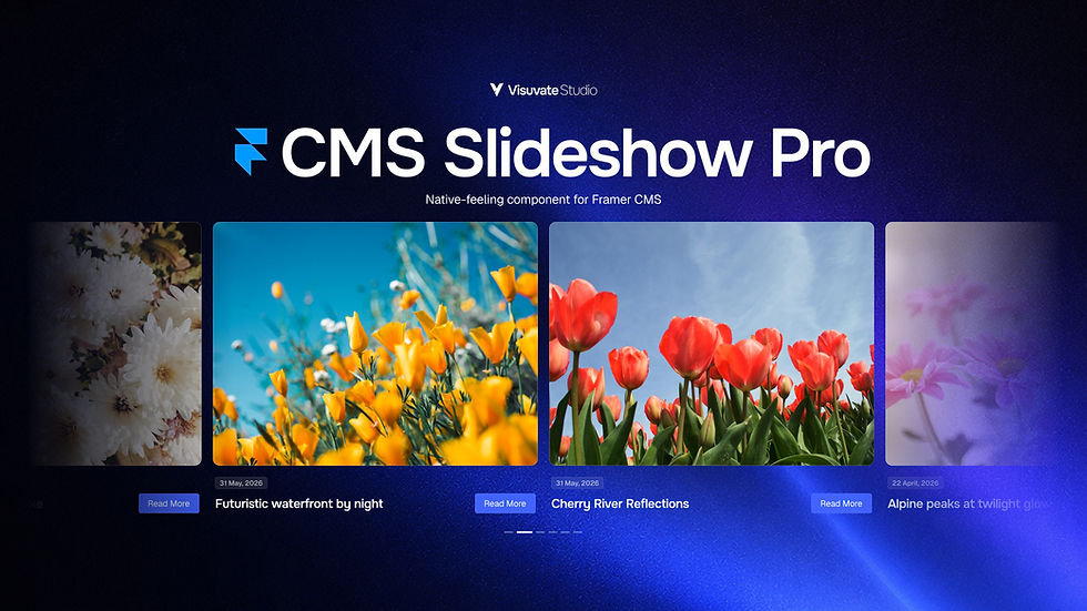
CMS Slideshow Pro is a powerful and highly customizable slideshow component for Framer CMS collections. Create responsive slideshows, infinite carousels, and continuous marquee layouts with advanced controls, smooth interactions, and native-feeling customization.

Web

Jan 10, 2026

Smart Animated Counters in Wix Studio
Learn how to add smart animated number counters to your Wix Studio site. This step-by-step guide provides a copy-and-paste Velo code snippet that automatically handles complex formats, such as 10k, $500, or 98% satisfaction.

Web

Smart Theme Switch ~ Framer Component

Smart Theme Switch – Add Light & Dark Mode to Any Framer Site

Smart Theme Switch is a Framer code component that adds a one-tap light and dark mode toggle to your site. It flips every page instantly, remembers each visitor's choice, and works with your existing Framer Color Styles automatically. No custom code, no duplicated styles, no flash of the wrong theme.


What Smart Theme Switch Does

Framer already lets you design light and dark variants of your Color Styles, but by default a visitor only ever sees the version that matches their device. There is no built-in way to give them a switch — and rolling your own means writing code that rewrites stylesheets, tracking state across pages, and hoping nothing breaks on export.

Smart Theme Switch handles all of it. Drop the component onto any page, point it at your brand colors, and it becomes a live control that flips your entire site between light and dark on a single tap. It reads the light and dark styles Framer already generates and re-applies the set the visitor chooses — so every background, text color, border, and surface repaints together, with zero manual wiring.


How It Works

When you use Color Styles in Framer, Framer compiles them into light and dark variants behind the scenes. Smart Theme Switch reads those variants and, when a visitor picks a theme, applies the matching set across the whole page — without ever modifying Framer's own stylesheets.

That approach keeps it safe and automatic. It works with the styles you already have, adds nothing to the page until a visitor actually interacts with it, and leaves your site behaving exactly like stock Framer for anyone who never touches the switch.


Smart Theme Switch
Smart Theme Switch


Features

Whole-Page Flip

One tap repaints the entire site. Backgrounds, text, borders, strokes, and every themed surface change together in a single click — not just the area around the toggle.

Remembers the Visitor's Choice

A visitor's selection is saved to their browser and restored on their next visit and on every other page of your site. Choose dark once and the site stays dark as they navigate and when they come back later.

Light, Dark, or Device

Set how the toggle starts:

  • Light — always open in light mode

  • Dark — always open in dark mode

  • Device — follow the visitor's system setting automatically, then let them override it

Style Every Part

Tune the switch to match your brand. Every part is a control:

  • Separate track and thumb colors for light and dark

  • Stroke width and color

  • Padding and corner sizing

  • Optional backdrop blur for glass-style tracks

  • Custom animation for the thumb, from a soft spring to an instant snap

Custom Icons

Show a sun and moon inside the thumb, or upload your own SVGs for each state with independent colors and size. Turn icons off entirely for a clean, minimal switch.

Built for Accessibility

The toggle is a proper switch, not just a styled div. It announces its label and on/off state to screen readers, is fully keyboard operable, and shows a customizable focus ring for keyboard users.

Multiple Toggles, One State

Place a switch in your header, your footer, and your mobile menu — they all stay in sync. Flipping any one of them updates the theme and every other toggle on the page at once.

Property Controls

Everything is editable from the Framer properties panel, no code required:

  • Default — Light, Dark, or Device

  • Label — the accessible name announced to screen readers

  • Track & Thumb colors — separate values for light and dark

  • Stroke — width and color

  • Padding — spacing around the thumb

  • Backdrop Blur — optional blur behind the track

  • Icons — show/hide, custom SVGs, colors, and size

  • Focus Ring — color and width

  • Animation — the thumb's transition

How to Add It to Your Site

  1. Install Smart Theme Switch from the Framer Marketplace

  2. Open your Framer project and drag the component onto your header or nav

  3. Set your light and dark track, thumb, and stroke colors to match your brand

  4. Choose how it starts — Light, Dark, or Device

  5. Publish your site

  6. The live flip runs on your published and preview links — tap it to test

Pricing

Smart Theme Switch is free. Install it from the Framer Marketplace and add unlimited toggles to your project — no license key, no usage limits.


Frequently Asked Questions


Do I need to set anything up for it to work?

No. If you use Framer Color Styles with light and dark values, the toggle works automatically. Just drop it in and pick your colors.


Will it work with my existing dark mode styles?

Yes. It reads the light and dark variants Framer already generates from your Color Styles, so it matches your existing design with no extra configuration.


Does the choice persist across pages and visits?

Yes. A visitor's selection is stored in their browser, kept as they move between pages, and restored the next time they return.


Can visitors follow their device theme automatically?

Yes. Set the default to Device and the site opens in whatever theme the visitor's system uses, while still letting them override it with the switch.


Will it slow down my site or affect SEO?

No. The component stays completely inert until a visitor interacts with it and never rewrites Framer's own stylesheets, so pages that are never toggled behave exactly like stock Framer.


Why doesn't the switch animate on the Framer canvas?

On the canvas and during export it shows a clean static preview by design. The live flip runs on your published and preview links, not inside the editor.


Can I use my own icons?

Yes. Upload custom SVGs for the light and dark states, set their colors and size, or turn icons off for a minimal look.


Built by Visuvate

Smart Theme Switch is built and maintained by Visuvate, a web design and development studio specialising in Framer and Wix Studio. We build tools for designers and developers who care about workflow quality.

visuvate.com


More Blogs

Jun 27, 2026

StyleSync ~ Import Styles
Import color and text styles from Figma, CSS, JSON, or any website directly into Framer as native styles — in seconds.

Web

May 31, 2026

Advanced CMS Slideshow for Framer
CMS Slideshow Pro is a powerful and highly customizable slideshow component for Framer CMS collections. Create responsive slideshows, infinite carousels, and continuous marquee layouts with advanced controls, smooth interactions, and native-feeling customization.

Web

Jan 10, 2026

Smart Animated Counters in Wix Studio
Learn how to add smart animated number counters to your Wix Studio site. This step-by-step guide provides a copy-and-paste Velo code snippet that automatically handles complex formats, such as 10k, $500, or 98% satisfaction.

Web

bottom of page